WearNGo
ANKLE RECOVERY MADE SIMPLE
ActiweightLabs came to us looking for the right name and visual identity for their innovative ankle trainer product.
We needed a name that captures the ease of use of the product, as well as suggest the benefits: that you’ll be able to improve your ankle mobility, rehabilitate after an injury and reduce the risk of re-injury quicker than expected.
WearNGo was the chosen name, together with a clean, subtle and minimalistic visual identity that would make the brand stand out on any channel.
The identity was brought to life via stationery, the presentation website layout and even the product itself.
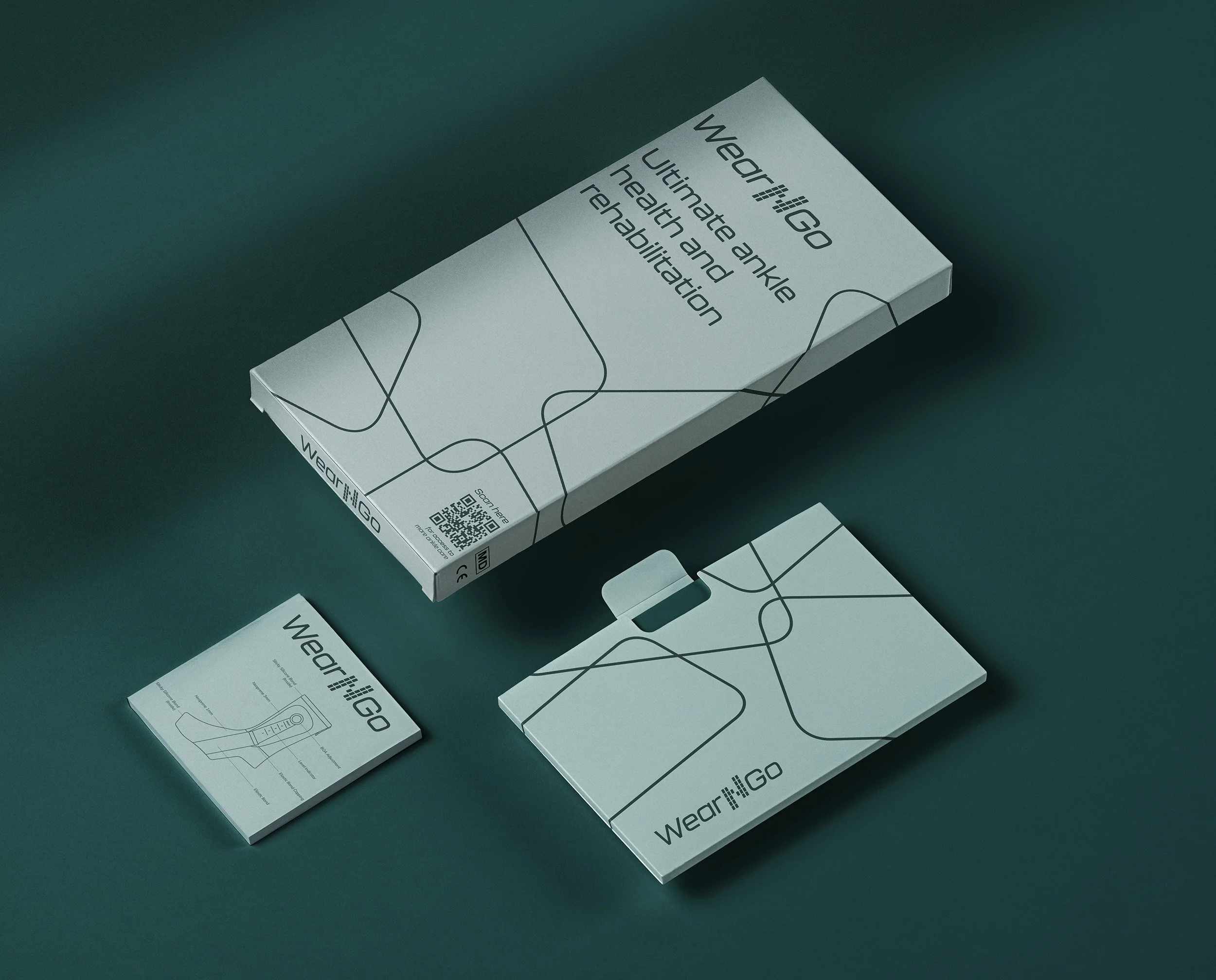
Ultimately, we were also asked to design the product packaging before it hit the stores.
The Visual Identity
WearNGo is a simple solution, for a fairly common problem, with a complex and innovative technology behind it that we didn’t know we needed. As the material holds the ankle in place, the logo is also held together by the geometric pattern representing the fibers interwoven into the WearNGo to make it such an innovative product.
With a tonal color palette, we were able to highlight the product’s medical qualities. Using Opal and Dark Slate Gray hues we have on foot in the medical field, spotlighting the real benefits of our product and how it imitates therapeutic workouts.
Using the Kallisto Medium Italic font for the logo and our headlines enabled us to focus on our innovative aspect, giving the logo a futuristic and techy feel. As a secondary font family, we chose Mulish, a highly versatile sans serif the complements the logo easily.
To build on this, we created a visual identity system that is both modern and striking, but also clean and trustworthy. Using the steps in the symbol, we created brand elements that can direct the viewer’s attention to focus on the product and its capabilities.
The Product Packaging
After the brand identity project was successfully implemented throughout all consumer touchpoints, the WearNGo team briefed us with a new challenge: to create the packaging for it’s innovative product.
The hardest part was to stand out in a segment where everyone looked the same.
The team understood the importance of not blending in just because everyone does it, so we took advantage of the fact that most products were using pictures of feet inside products on their packaging and went in the opposite direction.
We kept the packaging layout as clean as possible and used only a crafted technical scheme of the product on the front.
On the back side, we wrote the instructions and presented the benefits in a direct, simple manner, so that anyone can understand how it works and what’s in it for them just by spending a few seconds going through all the info.
Overall, an exciting and challenging project, seamlessly executed by working together with the awesome folks at WeaNGo. Can’t wait to see what’s next in store for them.


