Montalbetti Partners
Branding the executive search connoisseurs
Context
The executive search industry puts together great companies with great leaders. Companies look for the best of the best who can help lead their company to greatness, whilst candidates look for an environment where they can use their knowledge to the fullest. One of the key issues businesses will tackle from now on is “how to develop next-gen leaders”.
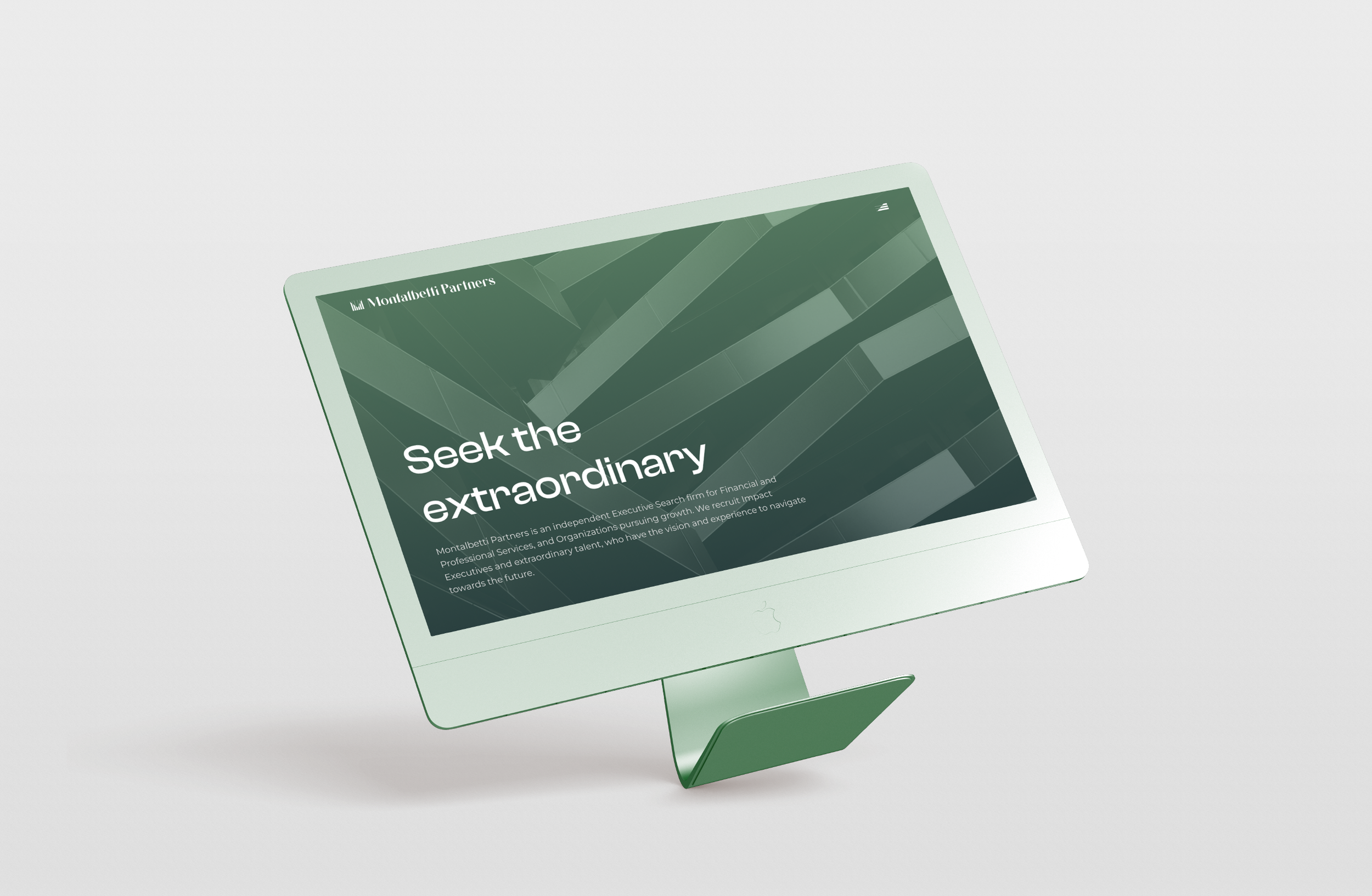
Montalbetti Partners is an independent Executive Search firm for Financial and Professional Services, and Organizations pursuing growth. They recruit Impact Executives and extraordinary talent, who have the vision and experience to navigate toward the future.
With this in mind, Montalbetti Partners aimed to position themselves as connoisseurs who have the insights to understand all the micro details needed to make the right match between a candidate and a company. Headhunters with prestige sustained by a deep knowledge of the market, a vast network and extensive local and authentic insights.
Strategy
We had to develop a unique strategic positioning of Montalbetti Partners as a trusted tailor-made executive search and leadership advisor navigating change makers towards the future.
Companies and candidates need to make a decision that can greatly impact their future, so they need to be certain they are making THE BEST CHOICE and Montalbetti Partners needs to be seen as the go-to partners in this quest.
Coming up with the slogan: „Seek the extraordinary!” we aimed at capturing the essence of the services Montalbetti Partners offers its clients and disseminating that quality in the overall image of the brand.


Execution
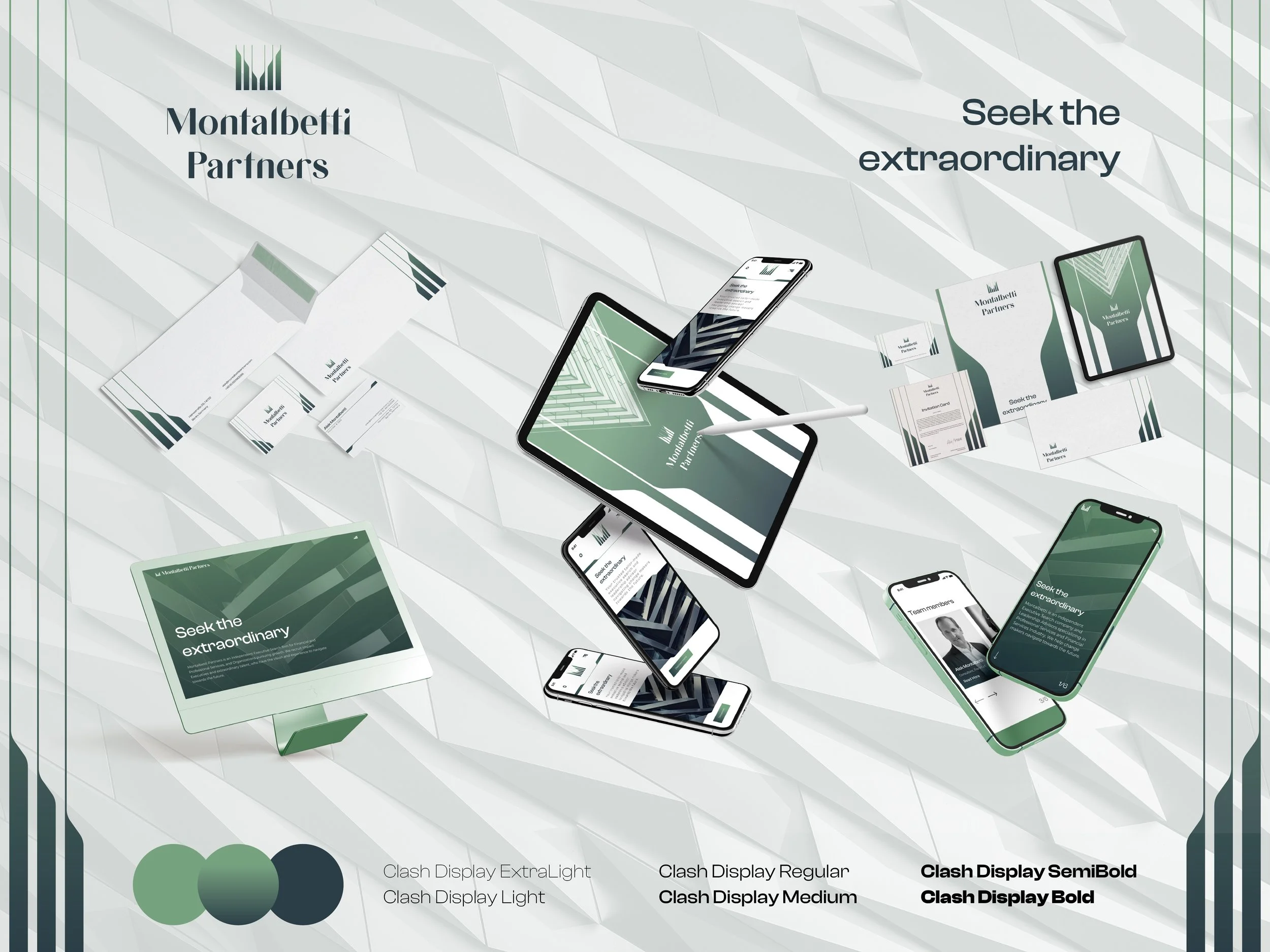
Our task was to develop the strategic positioning, the brand identity: logo and identity system, several brand materials, and the presentation website.
The monogram-like logo was constructed with the essence of Montalbetti Partners in mind. As such, growth was one of the key ideas that we wanted to integrate into the logo. The symbol is strong, and bold but also retains an elegance to it due to the thinning lines. If we are to look at the symbol as two halves, it represents Montalbetti Partners, face-to-face with its clients, funneling the perfect candidates toward their future positions.
Using only two shades of green, a custom gradient was also created to further establish this brand identity as a brand of the future. In creating the materials, we used the symbol in many distinct ways, such as expanding and exploding it and using it as a mask for images. The imagery for the visual ecosystem is sharp, modern and urban, such as playing with geometry and real working environments.
The presentation website highlights the professionalism and expertise of Montalbetti Partners, in simple, yet bold sections focused on the team’s expertise and approach.