When Branding Turns Bad
“Bad communication” can happen to anyone. Sometimes it’s just simply inevitable to avoid mistakes. Every startup and tech company dreams of creating a brand identity that resonates with its audience and makes them stand out in the crowd. But even the most successful companies are prone to branding missteps that can leave their consumers feeling as interested as a sloth at a marathon. The good news is that mistakes are an essential part of the learning process, and can be valuable opportunities for growth and evolution. We wanted to see how big players managed to “turn bad” and come back. That’s why, we explored some notable branding mishaps and how important companies responded to these challenges.
1. Slack, the workplace communication platform
When it first launched, in 2013, the brand used as a logo a colorful hashtag.
Many people found the logo to be confusing and messy.
It used too many colors, making it difficult to read against different backgrounds.
Slack used it for a while until they realized that the logo simply doesn’t work, or in their own words that it was “simply awful”.
In 2019, the company addressed its faulty former logo and came up with a refreshed look.
Not only that they decided to make a change, but they publicly admitted the reasons why the logo did not do the job anymore.
“It was also extremely easy to get wrong. It was 11 different colors—and if placed on any color other than white, or at the wrong angle (instead of the precisely prescribed 18º rotation), or with the colors tweaked wrong, it looked terrible. It pained us.”
It takes courage to do and say that!
To have the bravery to own your mistakes and move on.
And as a result, Slack now has a simpler and more refined logo and visual identity system, which was widely praised for having more versatility and clarity.
We admire that. It shows that any company, no matter how big or small, has its shortcomings, but facing them is only a step toward evolution.
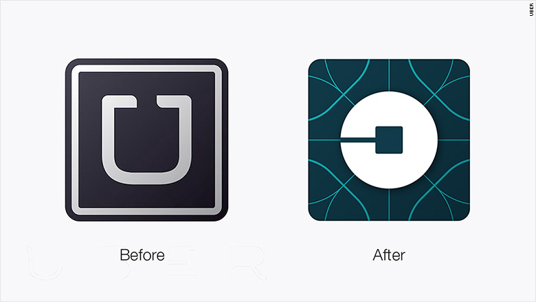
2. Uber, the company that disrupted the taxi industry
Uber needs no introduction. As big as the company is, as big their mistake was.
In 2016 they attempted a full rebrand, but unfortunately, they had to replace it in less than 2 years.
The new redesign was intended to represent the company's evolution beyond just ride-hailing.
But people perceived it as too abstract and complicated. The new logo was widely criticized for being confusing and difficult to identify as Uber. The visual system overall lacked consistency and the design elements used through various materials felt disconnected.
For some, it represented a pretentious approach and moved away from the simplicity that characterized the brand.
And what do you think: the “failed” Uber rebranding was done in-house. It’s what we often see happening in startups. Founders believe they can do everything and that they should make all the decisions. They are often good at product engineering and believe they shouldn’t seek expert advice for perception engineering.
But that can have serious consequences. If you want to chart your way forward, it’s essential that you consult professionals.
Uber decided to do this in 2018 when they re-rebranded in order to reinforce more of their core value.
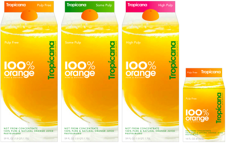
3. Tropicana, the popular juice brand
As you can see, rebrandings are a tricky business. And both tech and non-tech companies can get it wrong.
In 2009, Tropicana launched a redesign of its packaging that featured a more modern and minimalist design.
However, a few days later the new packaging started to be widely criticized on social networks. Consumers felt that it looked generic and unappealing.
And not only that, but they didn’t feel connected to the new one. Emotionally and physically. Because too many elements of the original packaging (the orange with the straw, the logo, and the focus on “100% juice” instead of “Pure Premium”) were changed they couldn’t recognize the product on supermarket shelves.
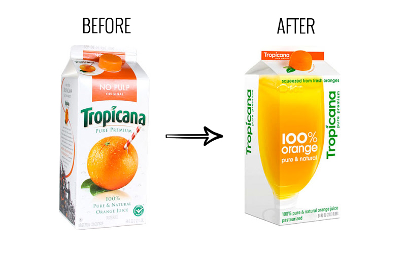
Two months later, sales dropped by 20%, and this spectacular decrease in sales represented a severe loss of 30 million dollars for Tropicana.
This even made some people say that “it’s the worst rebranding in history”.
So how do you recover from something like this?
You acknowledge your mistake and make a change as drastic as the one that got you here in the first place.
After just a few months, Tropicana reverted to its original packaging design in response to the negative feedback.
Although learned the hard way, the company got a valuable lesson: your consumers are the most important thing you have. That’s why, they expressed a commitment to better understand and meet the needs of their consumers.
And we actually think they did that. They recovered from the crisis, and in 2011 they dared to once again change their design. And this time it was well received.
If we were to draw a simple conclusion, we would say that: mistakes always happen since no brand or company is perfect. And that’s perfectly okay as long as you admit them and move forward.
For anyone finding themselves in a similar situation, we developed the Perception Scan - the reality check that can help your company start paddling towards progress.
By Adriana Luca