3 Romanian startups rediscovered their identity

As a startup agency, we are constantly discovering exciting new clients who operate in even more exciting tech areas. However, we have not forgotten our roots. Today, we open our soul and portfolio to present you 3 Romanian startups and 3 projects that we were thrilled to work on.
Solo is a mobile app that offers digital accounting services to registered sole traders and freelancers on a monthly subscription basis. Basically, it replaces bureaucracy, queues and wasted time with an app, digitizing a sector that in Romania still looks as it did 40 years ago.

“In the research done to build the brand positioning on the market, we noticed that a registered sole trader interacts with the National Trade Register Office, the National Agency for Fiscal Administration etc., regardless of whether they choose to do their accounting by themselves or through an expert. But no matter how they manage their bookkeeping or how much they trust their bookkeeper, they always fear a possible fine or seizure. Solo is a one-stop shop that makes your activity simpler from its establishment, going through daily administration, invoicing, new laws, and up to the strangest questions or situations, without leaving room for human error. So it was simple and natural to say that Solo is: Your digital accountant who solves everything.” Teodora Turcu, Brand Strategist
The next steps were to define an appropriate tone of voice and create a visual identity in order to distinguish Solo from the multitude of online accounting services. Following the strategic positioning, we realized that Solo as a brand is competent, customer-oriented, and able to simplify complicated things, so it will communicate in an informed, confident, positive, attentive, empathetic, simple, and accessible tone.

"In terms of visual identity, the oscillations in the logo represent the feeling of insecurity we have when we run into bureaucracy or complex accounting issues. But the final look of the logo which is balanced, brings calm, simplicity, and security in this unpredictable world. The chosen font, with its modern and human features, is full of character and reflects the approachable and empathetic personality of the brand. It is also amplified by the color palette that moves away from the commonplaces of accounting or the tech field, being, instead, familiar to the end-user because it humanizes the brand even more." Zorán Zeerowski, Head of Art

Solo will be launched soon, and in the future, its services will be extended to LLCs with few or without employees.
"Heraldist helped us synthesize the essence of our product - the place where everything related to your registered sole trade is solved. Simple and in plain language. The team was always available, open to feedback and they translated into words and images our vision of SOLO.", Annemarie Fabian, Solo co-founder
For us, this was just the warm-up. With creativity sleeves rolled up, we can't wait for the campaign briefs.
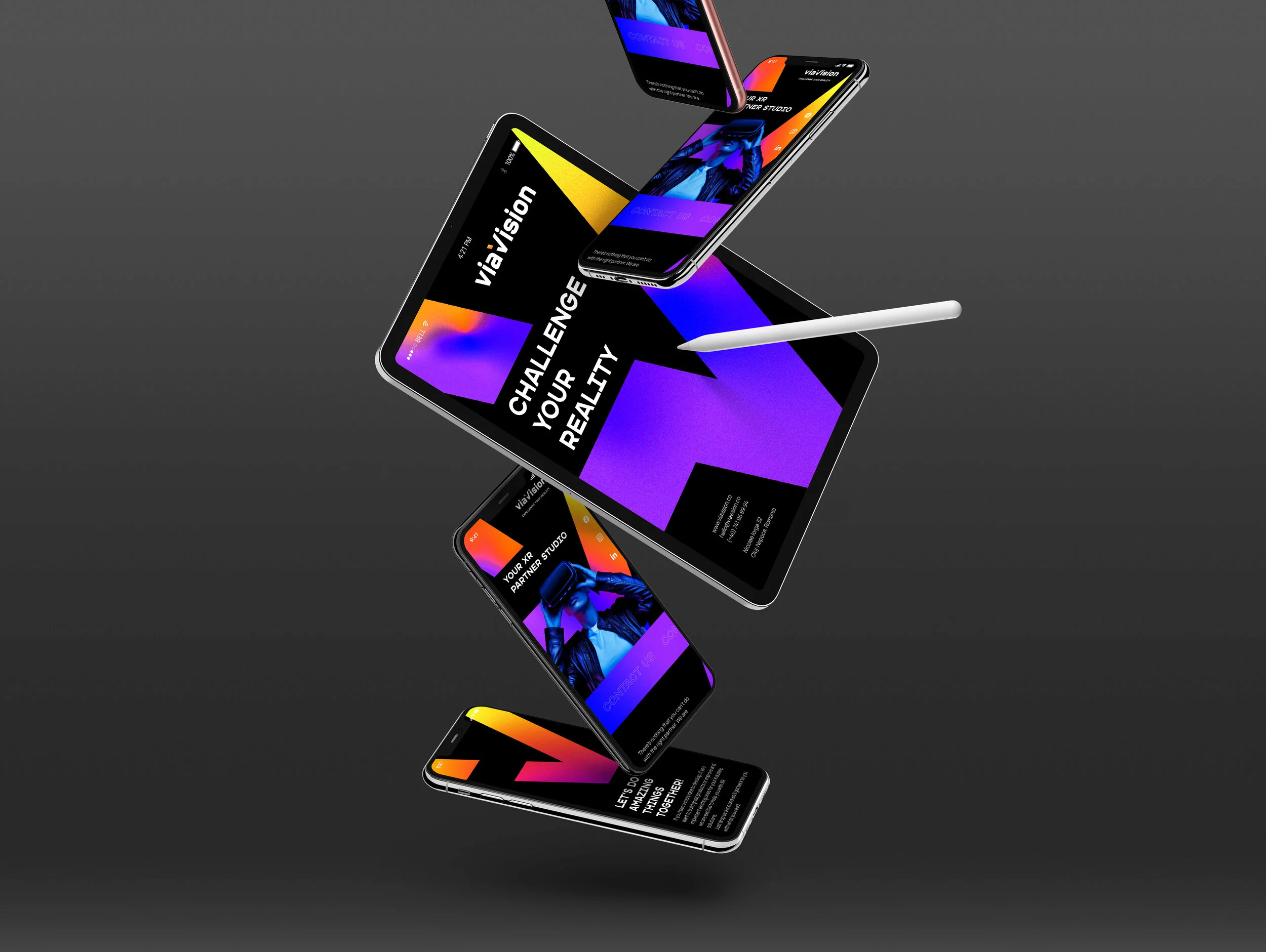
viaVision studio’s home field is the XR (Extended Reality) - a new and constantly evolving field, with applicability in entertainment, education, but also in the medical, aeronautical or military field. What do they do exactly? They create human-centered 3D digital products and experiences and deliver XR solutions focused on real needs.

"What pleasantly surprised me at viaVision team is the empathy. In each project, in addition to the fact that they are dedicated 100%, the team members always manage to put themselves in the shoes of the end-user, to create experiences for its benefit. They have a multidisciplinary background which offers multiple perspectives on the challenges of each project. And they also use technology in a way that improves people's experience. So we naturally positioned them as Insightful XR solutions for business challenges." Teodora Turcu, Brand Strategist

Shaping a visual identity based on the strategy was only a step further. But one with several rounds of feedback :).
"Just as atoms are the basis of all things around us, in digital space, pixels are the primary form of everything we perceive. Starting from a simple pixel, we built a story that shows its potential, when it comes to XR. Creating new worlds via your vision allows a suite of unseen experiences and sensations, which is why the visual identity was thought to be everchanging. The gradients from the brand ID were designed to change both their shape and structure, depending on the vision of each person, and the logo was created to show how applying these visions to an idea can lead to incredible things. By cutting the letter "V", we obtained a checkmark completed by the expertise and creativity of viaVision." Stefan-Andrei Pop, Art Director
From the other side of the internet we got a reply that says: "Heraldist's work effectively contributed to the new brand identity of the company. The team has a clear plan when it comes to deliverables, exceeding the client's business goals. They are prompt, skilled, and easy to work with. They really care about their clients and they love what they do." Sebastian Chețan, Product Manager & founder viaVisionXR
We wish viaVision beautiful and efficient dreams and we hope they won’t keep for themselves the dreams that could enrich us all.
When our clients from Bant.io told us for the first time about a scientific method that could multiply sales in a seemingly magical way, our first reaction was: "BS!" In the meantime, they convinced us. And we became friends. In addition, we developed their strategy and renewed their Brand ID. For those who don't know yet, Bant.io provides Lead Generation Services that help businesses automate the process of recruiting new customers through a data-driven method.

In a market where competitors are either agile, or looking for new jobs, everyone promises great tools, fresh and warm leads, and claims they are the best. For an untrained eye it is difficult to spot the differences. But not for us.
"Looking a little closer at what makes Bant.io special, we realized that they use a strategy borrowed from the IT area: the testing. Every lead generation campaign that Bant.io launches is tested and improved throughout, delivering more and better leads than others. That's how we positioned them as Intelligence that gives you an unfair advantage in B2B sales growth". Teodora Turcu, Brand Strategist

How can our visual identity help this brand to differentiate in a crowded, messy market, where there’s a little bit of everything, for all tastes and needs? When almost everyone out there cries out that they have the best tools for attracting potential customers, choosing a product is hard.

"Following the strategy, we knew we had to come up with a bold logo that would reflect the brand’s efficiency. After realizing, stylistically, in which direction we want to go with the design, we found ourselves in that rare but happy situation in which the client was our source of inspiration. They came up with the idea to use the funnel symbol because it is very representative of what lead generation means. The result was a strong and versatile logo, which can be used either in big sizes or with a fine outline. At the same time, it allows us to be very playful in the visual communication, without losing coherence or consistency.'' Zorán Zeerowski, Head of Art
In the end, we just hope creativity, courage, and the new brand identities will help these Romanian startups find their way to global success so they could change the world for the better.